Editing Mega Menus
Editing mega menu drop downs
Support for web templates that include a Mega Menu. This template style includes a style file named "menu-styles.css". The menu file is located in the "includes" folder and is named "menu.htm". Mega Menus include images and link lists in the drop down.See the help.html included with your template for the correct support link.
Files used in mega menus:
Edit the "menu.htm" in the "includes" folder for menu text and links. Menu images are in the "menu-picts" folder. Colors, fonts, sizes, padding, margins are edited in the "menu-styles.css".
Mega menus use an unformatted HTML page as the global menu file. When you open this page you will not see any styling, just plain text and links. You can only view the menu with all styling after an edit by opening one of the template HTML pages like the "about.htm" or "index.html".

Make Backups: Mega menus are complicated and errors can compromise the formatting making the menu not work as designed. Periodically make backups of the "menu.htm".
See also jQuery Includes for more details.
Changing menu names or links:
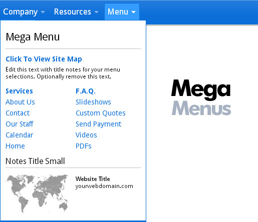
You can edit all the menu and submenu titles (names) and links. Open the "menu.htm" in the "includes" folder in any plain text editor like Notepad in Windows or TextEdit on Mac. Check the visual link below.

Adding top level buttons:
Caution: Mega menus are large and take up a lot of screen space. It is recommended that you limit the number of top level links to as few as possible until you are more familiar with how they will work on mobile. It is important to hide some menu buttons on mobile (see section below). See also Checking Media Queries on PC and Mac.
You can copy any "block" of menu code to add a new top level button. Keep in mind that menus may be 1, 2, 3, 4 or 5 columns, that some are right aligned, and some are hidden on mobile. Check the visual link below to add a top level button.

Understanding mega menu columns:
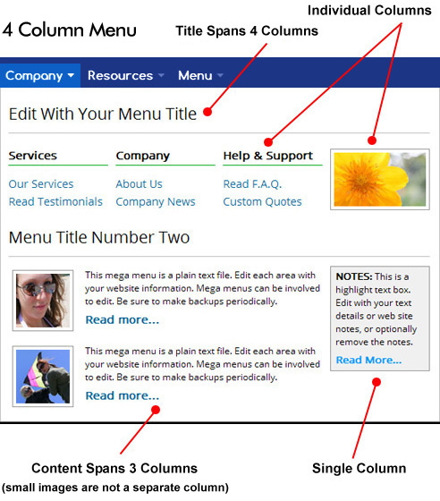
Mega menus work on a series of columns. The column width is defined in the "menu-styles.css". Some columns span across multiple columns and some cells are a single column. Check visual below.

- The first column class (example: dropdown_4columns) is the number of columns used in the menu block (see above visual). Column classes after the first are the number of cells the column cell spans.
- Col classes (col_1, col_2, etc) are the number of cells the cell should span.
- 5 is the maximum number of columns you can use in any menu.
- You can copy the contents of one column cell into another cell.
- Make backups of the "menu.htm" and "menu-styles.css"!!

Hiding some top level buttons on mobile devices:
As you narrow your browser width with a template page open, you will see some top level menu items disappear. The default menus setup in mega menu templates hide some of the drop menus on mobile using one of the Media Queries classes "hidemenu" at the bottom of the "menu-styles.css". Media Queries are setup to hide the menus at width breakpoints 920, 740, 600 and 482. The menu does not use all these breakpoints but you may want to use some of them as you add more top level menus.

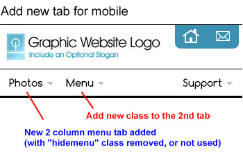
Setup your "hidemenu" classes so only 2 column width menus will display on mobile devices. See also section below to add another mobile 2 column menu tab.
Why hide menus?
- Mobile devices can only display 2 column width menus.
- Too many top level menus will wrap if the screen width is too narrow.
- If you add new top level menus, test your webpages. See Media Queries support and Testing Media Queries on PC and Mac.
Right and left menu alignment:
You can align menus to the left or right using the 2 classes "menu_right" and "align_right" as in the following example. The right side menu items align in reverse order, right to left; the first menu item will be the farthest right.
<li class="menu_right hidemenu3"><a href="index.html" class="drop">Media</a>
<div class="dropdown_3columns align_right">
The template includes samples of both left and right menus. You can see the code in the "menu.htm".
Removing the top level arrows ( to make more room ):
Edit the "menu-styles.css" and find the following 2 classes. Edit and change (remove) the menu arrow images and change the right side padding to 6px.
This is what you have now...
/* TOP LEVEL - MENU ARROWS */

#menu li .drop {
     padding-right: 22px;
     background: url("menu-picts/menu-arrow-gray-50.png") no-repeat right 11px;
     }

#menu li:hover .drop {
     background: url("menu-picts/menu-arrow-black-100.png") no-repeat right 11px;
     }
...edit to the following (edit 3 places), as highlighted in red:
#menu li .drop {
	padding-right: 6px;
	background: transparent none;
	}

#menu li:hover .drop {
	background:  transparent none;
	}
Menu colors and fonts:
All the colors used on the menu can be edited in your "menu-styles.css".
Top level padding:
Padding in the top level buttons can be tricky. If you want more padding start by editing the "height" px number in the following class near the top of the "menu-styles.css":
#menu	{
	list-style: none;
	padding: 0px;
	margin: 0px auto 0px auto;
	height: 38px;
	}
Next, edit the "line-height" px number in this class keeping it smaller than the height in the above class to adjust the menu text vertical location:
/* TOP LEVEL - FONT FACE, COLOR & SIZE */

#menu li a.drop {
	color: #000000;
	font-family: "Comfortaa", arial, sans-serif;
	font-size: 15px;
	font-weight: 700;
	line-height: 26px;
	padding-left: 6px;
	}
Then look at the notes in the "menu-styles.css" for other specific padding. In older versions of the "menu-styles.css" (before Ver 1.2.a) you may need to contact us for an update.
Adding a link that opens in a new window:
For new browser window links, use the highlighted target code below:
<a href="PDFgallery.htm" target="_blank">PDF Downloads</a>
Shifting the pop open menu location
Setup wide menus to open to the far left.
Check the top line in your "menu-styles.css". If you have a note "MEGA MENU Ver 1.2.a" or higher, you can use the following option. If you do NOT see this note skip to the next section "Advanced Users".
With menu ver 1.2.a and higher you can have the menu pop open on the far left to save room and allow for wide menus. The second menu in the template download includes an example of this option with the following code:
<!-- START MENU 2 (3 - COLUMN) -->

<li class="hidemenu3 shift-left-top"><a href="#" class="drop" onClick="return false;">Resources</a>

<div class="dropdown_3columns shift-left">
As shown above, adding one space, and the shift-left-top and shift-left classes to the menu button will make it open to the far left.
For mobile 2 column menus, when you want the menu to shift left ONLY when viewed on smartphones, use the mobile-shift-left-top and mobile-shift-left class as in the following example:
<!-- START MENU 3 (2 - COLUMN) -->

<li class="mobile-shift-left-top"><a href="#" class="drop" onClick="return false;">Menu</a>

<div class="dropdown_2columns mobile-shift-left">
Optionally review steps #5 and #6 below for more info.

Advanced users: Shifting the pop open menu location
If you have a note "MEGA MENU Ver 1.2.a" or higher at the top of your "menu-styles.css" see section above. The classes as outlined below have already been added to your "menu-styles.css".
Wide menus pop open too far to the right on desktop computers, or a 2 column mobile menu opens too far to the right. See next section to add a 2 new classes to solve both of these problems.
Advanced users: Adding a second 2 column menu for mobile
This works for both adding a second 2 column mobile menu, or for shifting wide menus (4 or 5 columns) to pop open on the far left in the browser.
Problem: Menu opens too far to the right, or on mobile you have added a 2nd two column menu, with the "hidemenu3" removed, and the 2nd menu tab pops open too far to the right on mobile.
Solution: Add 2 new Media Queries classes to make the menu pop open to the far left. Do the following steps:
- See section "Adding top level buttons" above first.
- In the "menu-styles.css" near the bottom, inside the media Queries 600 section, add this new class. Add it right after the class "#menu li.hidemenu3 { display: none; }":
/* FOR 2 COLUMN MOBILE MENU TO OPEN FAR LEFT */

#menu li.mobile-shift-left-top  { position: static; }

#menu li:hover .mobile-shift-left
	{
	position: absolute;
	left: 3px;
	top: auto;
	z-index: 1500;
	-moz-border-radius: 0px 0px 0px 0px;
	-webkit-border-radius: 0px 0px 0px 0px;
	border-radius: 0px 0px 0px 0px;
	}
...or for menus that are just too wide, add this code just above the Media Queries section. Add it before the first "/***************" note you see (around line #425 or so).
/* WIDE MENUS TO OPEN FAR LEFT */

#menu li.shift-left-top  { position: static; }

#menu li:hover .shift-left
	{
	position: absolute;
	left: 10px;
	top: auto;
	z-index: 1500;
	-moz-border-radius: 0px 0px 0px 0px;
	-webkit-border-radius: 0px 0px 0px 0px;
	border-radius: 0px 0px 0px 0px;
	}
IMPORTANT: If using ".mobile-shift-left-top" and ".mobile-shift-left" it goes in the Media Queries section, if using ".shift-left-top" and ".shift-left" it goes just above the #1 920 Media Queries section.
- You may need to adjust the border radius and "left: 3px;" location.
- You can optionally add all the classes shown above to the "menu-styles.css".
- Now we will add the new classes for mobile shifting to the 2nd menu tab that is mobile viewable, not the 1st tab, and it may not be the 2nd tab either because that one may not be mobile viewable. In the "menu.htm", find the 2nd mobile viewable menu tab and add your 2 new classes like the following with one space between it and the "dropdown_2columns" class:
<!-- START MENU 3 (2 - COLUMN) -->

<li class="mobile-shift-left-top">
<a href="#" class="drop" onClick="return false;">Menu</a>

<div class="dropdown_2columns mobile-shift-left">
...or for menus that are just too wide on desktop, use these 2 classes instead on any menu tab:
<!-- START MENU 6 - (4 COLUMN) -->

<li class="hidemenu3 shift-left-top">
<a href="#" class="drop" onClick="return false;">Menu Name</a>

<div class="dropdown_4columns shift-left">
- Remember, to have any menu tab display on mobile, remove the "hidemenu3" class from the start of that code group. But only use 2 column menus for mobile. See also Checking Media Queries on PC and Mac.
Editing with Frontpage:
Although templates with mega menus are HTML5 templates, you can still edit the mega menu "menu.htm" file in Frontpage if you set your options first. Select "Tools" then "Page Options" then "HTML Source" and click on "Preserve Existing html". Frontpage will now not disturb any existing html code.
Troubleshooting Section:
Mega menus not working:
Mega menus use jQuery "include" code to display the "menu.htm" as an embedded page in your main template pages. Some browsers will not display the embedded page off-line.
Menu not working off-line
- For more troubleshooting see jQuery Includes.
- If you open the page "menu.htm" in a web browser it will appear unformatted. This is normal. You need to view one of your template pages like the "about.htm" or "index.htm" to see the menu with the font and color formatting.

- Some browsers can not display jQuery "includes" off-line. Try using a different browser for off-line testing.
- In Google Chrome (Windows) you can use the switch "--allow-file-access-from-files". Create a desktop icon to Google Chrome, right click for properties and add the switch like the following (copy only the switch code, use one space before):
"C:\Documents and Settings\user\Local Settings\Application Data\Google\Chrome\Application\chrome.exe" --allow-file-access-from-files
- For Mac solutions see the troubleshooting section on the jQuery includes support page.
- If the jQuery "includes" are not working off-line, you can download different browser software for off-line testing.
- If you can not use a browser that shows the menu when working off-line you may need to upload for testing.
Mega menus and SEO:
It is recommended that you include a link to the "site map" html page on your "index.html", and list all your pages on the "site map" html page for both SEO and high mobile device and tablet compatibility. This action will ensure that all your webpages are listed in Google and other search engines.
Related Topics:
Links Not Working After an Edit
Adding and Removing Pages

