CSS Mobile Select Overlay (Built-In)
Responsive CSS mobile detection overlay script
Function: The mobile select overlay is included in some templates that include both a full and mobile website. It is css code. The overlay is setup in the HTML pages of the full site. When the browser width becomes narrow (482 or 652 pixels), as on cell phones, the css Media Queries code becomes active and displays a box in the center of the webpage with the option to click to view the mobile template version. It is a form of mobile detection using CSS3.Note: This support page is for the overlay built into some templates. If you purchased just the free-standing overlay see mobile overlay add-on.

- The "select-overlay.css" hides the overlay until a browser or device is 482 (or 652) pixels or less wide. Edit the code near the bottom (3 places max-width) to change the threshold at which the overlay will appear.
- The "HTML pages" contain one line of code for the .js file to show the overlay. The code will be near the bottom in the source code and will be the following:
<script type="text/javascript" src="mobile-select/select-overlay.js"></script>
- The "select-overlay.js" contains the overlay box, link text and close button. It includes scripts to close the overlay when a user clicks either the close button or outside the overlay center box.
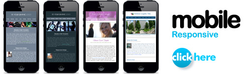
Select overlay images:
Images used will be located in the "mobile-select" folder. Both black and white images will be included. Optional images and PSD files may be included in the "extras" folder.
To change the icon color: Edit the 2 variables near the top of the "select-overlay.js" to "black" or "white" (all lowercase).
Phone icon styles:
In the "select-overlay.js" edit the "var phonestyle" to "1", "2" or "3" to use a different style of phone image.
Removing the select overlay:
Turn off the select overlay in the "select-overlay.js" by editing the "var mobileselect" from "yes" to "no".
Overlay colors:
To edit the overlay colors, edit your main css file (style.css, coolstyle.css or corporatestyle.css). If you have a color theme template edit the .css file in the "colors" folder for the color theme you are using. Example, if you have "blue" set in your "colortheme.css" edit the "blue.css" in the "colors" folder.
Colors and styles in the .css file will follow the comment: /* MOBILE SELECT OVERLAY */
Overlay width, location and layout:
Edit the "select-overlay.css" in the "mobile-select" folder to change the overlay location and other layout elements.
Setting the threshold width:
At the bottom of the "select-overlay.css" in the "mobile-select" folder you will see 3 codes for "min-width" shown below. They may be set at 482 or 652. This is the width a browser must be for the overlay to display. You can edit the 3 widths to any number you would like. The widths should be set at a width that is less than your full website width. 482 is the general standard to use. Also often used is 768 or 801.
@media handheld and (max-width: 652px),
screen and (max-device-width: 652px),
screen and (max-width: 652px)
Note: If you set the threshold greater than 768 the overlay may display on some tablets.
Testing the overlay:
In any CSS3 complaint browser, make the browser width narrow. The overlay will display if the browser is CSS3 complaint and when the browser width becomes more narrow then the threshold that is set in the "select-overlay.css" file. See section above.
Adding Automatic Mobile Detection:
See Automatic Mobile Redirection support.
Overlay Not Working as Expected:
On some mobile devices in some orientations the css overlay may not popup. The overlay uses passive css code to detect the device browser width. If the cellphone has a larger screen and higher resolution then the overlay will not popup. Here are some options you can explore.
- Larger cell phones may be able to see your website fine and do not need to be directed to the mobile version. In this case you can optionally add some simple Media Queries to make fonts larger on medium sized small screens. Add a second stage of Media Queries with a larger threshold like 801px. See Media Queries Responsive CSS Code.
- Set the threshold to a higher number. See section above "Setting the threshold width".
- Add mobile auto detection. See Mobile Sites for details.
- On the specific device the overlay may show in portrait view but not in landscape view.
Ordering an overlay for your website:
See CSS mobile select overlay addon to get this application for your website.