jQuery Responsive Slideshow
Support for responsive jQuery slideshows

Support for Allwebco templates with responsive jQuery slideshows. You should see a file named responsive-slides.js in your "JQuery" folder if your template includes this feature. The "jQuery" folder may be inside your "mobile" folder. Refer to the help.html included with your template download for the correct support links.
See Instead…
See Instead…
- See links in sidebar on this page

Your slideshow should look similar to the above (buttons may be layered over the image).
Editing each slide:
Replace the images in the "slideshows" folder. If the slideshow is on the homepage, images are in the "JQuery" folder. If you are working with a mobile sub-site webpage the "slideshows" folder may be up one folder in the full template folder. See your "help.html" for specific file locations.
jQuery files used:
Files used on the responsive slideshow page are located in the "JQuery" folder (this folder may be inside a "mobile" folder). The border and sizes code will be in the style .css file in the "JQUERY SLIDESHOW" section (.css files may be inside a "colors" folder). The .css "non-color" code (button margins and location) is in the "responsive-slides.css" in the "jQuery" folder.
Adjusting the height and width:
Images in this slideshow are responsive and will flex to fit the browser window. A max-width is usually set in the in the style .css file in the "JQUERY SLIDESHOW" section. The homepage max-width will be in the first "JQUERY" section, and later in the css file will be a max-width for the slideshow sets if your template includes the sets.
Options in the "responsive-slides-SETS.js":
The "responsive-slides-SETS.js" in the "JQuery" folder includes variables you can edit to change timing and to set "auto" to true or false. Click "visual" below.

Homepage jQuery variables will be in the "responsive-slides.js". Slideshow "sets" use the "responsive-slides-SETS.js".
Button colors:
CSS code for the responsive slideshow colors will be located in the "style.css" in the "JQUERY" section (in color theme templates edit the .css files in the "colors" folder). Additional padding, alignment and button location and size code is located in the style file "responsive-slides.css" in the "JQuery" folder.
Next and back button png images are in the "JQuery" folder. A PSD file is located in the "extras" or "extras-mobi" folder.
Adding more slides:
Open any one of the "slideshow?.htm" pages (or index.html) for editing. Find the note "START SLIDESHOW IMAGE LIST" or "START JQUERY CYCLE". Copy the last image line in the list and paste it below itself. Edit the new line with the next .jpg image name and next "alt=" tag image name. Click "visual" below.
Adding a link to each slide:
(Check first if your slideshow already includes links by clicking on one of the slides) Because the cycle slideshow is an "image only" slideshow, normal html page links can not be added, however, you can add links using the Javascript "onclick" event.
Copy and paste the following code:
onclick="javascript:location.href='about.htm'" style="cursor:pointer;"
...add the code above to each image you want to have link to another page or website like the following image #1 example. Include 1 space between the existing code and the new link code you are adding:
<li><img src="JQuery/imageJQR-1.jpg" alt="Image 1" onclick="javascript:location.href='about.htm'" style="cursor:pointer;"></li>
Dot buttons or arrows hiding on desktop or mobile:
Your template may be set to hide the next/back arrows on desktop view, and hide the bottom buttons on mobile. These are set using "display: none;" in either the style .css file (hide on desktop), or in the "media-queries.css" (hide on mobile). Look for "display: none;" in the "JQUERY" sections in the css files. Change the css to "display: block;" to make the buttons display.
- See also: Elements hiding on mobile
To optionally hide the dot buttons on desktop and mobile, edit the "responsive-slides.css" in the "JQuery" folder. Add display: none; as in the following example:
/* START ROUND ACTIVE BUTTON STYLES (COLORS IN OTHER CSS) */

.centered-btns_tabs,
.transparent-btns_tabs,
.large-btns_tabs {
	max-width: 100%;
	padding: 0px;
	text-align: center;
	display:inline-block;
	*display: inline;
	zoom: 1;
	margin: 0px auto 0px auto;
	display: none;
	}
In some cases you may need to edit the .centered-btns_tabs css class code in the jQuery section in the "style.css" (or your main css file) and add display: none; as in the following example:
/* SLIDESHOW ROUND ACTIVE BUTTON STYLES */

.centered-btns_tabs	{
			width: 100%;
			position: absolute;
			bottom: 10px;
			left: 0px;
			margin: 0 auto;
			text-align: center;
			z-index: 1000;
			background-color: transparent;
			display: none;
			}
Making the homepage slideshow full width:
Do the following steps to have the homepage slideshow be full browser width.
- Make a backup of your files before you start!
- In the "index.html" move the jQuery code group between the tags "START JQUERY CYCLE" and "END JQUERY CYCLE" up on the page so it's just after the menu line.
<!-- MENU -->
<script type="text/javascript" src="menu.js"></script>
<!-- START JQUERY CYCLE -->
(move jQuery slideshow code group)
<!-- END JQUERY CYCLE -->
- In the "style.css" about 1/3 down find the /* HOME JQUERY SLIDESHOWS */ note. In that area edit the class ".rslides_container" max-width to 100% like the following (it will probably be 900px now).
.rslides_container { background-color: #C0C0C0; max-width: 100%; min-width: 250px; ...(clipped) - You may now need to edit the outer padding. This should be the class higher in the "style.css" named ".pagebox" or the "wrapper" class may have padding.
- In some templates you may need to also adjust the menu and header logo padding as well as make the menu "border-radius" 0px in 3 or 4 places in the very first class in the menu css file.
- In the "responsive-slides-SETS.js" in the jQuery folder edit the maxwidth variable to something like 8000. Click "visual" below.
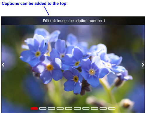
Adding a caption to each slide:
This mod will add a unique caption to each slide in the slideshow sets pages (slideshow-1.htm, 2, 3, 4) and can also be used on the homepage jQuery.
- Check that your template has a "responsive-slides.css" in the "JQuery" folder. This is to confirm that you have the correct slideshow version. Do NOT edit this file.
- Select and copy the following code and add it to your "style.css" at the bottom of the jQuery slideshow section. Exactly where you add it is not important, you can even add it to the very bottom of the "style.css" file if you are not sure.
.rslides_container li div { color: #FFFFFF; font-size: 13px; text-align: center; background: #000000; /* BACKGROUND FOR NON-CSS3 */ background: rgba(0,0,0,0.6); /* BACKGROUND 60% OPACITY */ width: 100%; padding: 5px; position: absolute; left: 0px; top: 0px; box-sizing: border-box; -moz-box-sizing: border-box; -webkit-box-sizing: border-box; } - In the "slideshow-1.htm" (or "index.html") edit the list of images, adding the <div> and div closing </div> with your caption text between these tags. Below is an example (highlighted in red) of how to edit the first image and add the caption.
<li><img src="slideshows/Fslide1-1.jpg" alt="Slide 1"><div>Image Description One</div></li>
- Test the "slideshow-1.htm" or "index.html".
Tips & Issues
Loading Speed Tips:
- It is recommended that you not exceed about 20 images at 50kb each or a total of about 1.0 megs for the slideshow (ie: 10 images at 100kb each).
- In the slideshow it is best to make the first image the smallest in byte count (simplest image) so it can buffer for subsequent images.
Troubleshooting
If the slideshow is not working on your webpage, check the following:
- While editing you may have created an error in one of the jQuery files or html pages. You can request a new download for a new copy of the slideshow pages and the "JQuery-Content" folder.
- There may be a problem with one of your images. Try re-saving your .jpg images again with different save settings.